You built something. You think it works. But your users keep dropping off at the same screen, and your support inbox tells a different story than your analytics dashboard.
The fix isn't more data. It's better questions. User testing questions are the prompts you give real people while they try to use your product - and the answers tell you exactly where things break down. The right questions surface confusion, frustration, and workarounds that no amount of heatmap data will show you.
This guide gives you 40 questions organised by when to ask them: before the test, during the task, and after. Each one is designed to pull out a specific type of insight. And if you record the sessions on video, you get something surveys never deliver - the hesitation before a wrong click, the squint at confusing copy, the sigh before someone gives up.
Why the questions matter more than the tool
Most user testing guides jump straight into software recommendations. Pick a platform, recruit participants, run the test. But the biggest variable isn't the tool - it's what you ask.
A vague question like "What do you think of the homepage?" gets a vague answer. "It's fine." That tells you nothing.
A specific question like "What would you click first to find pricing?" forces the user to act. You watch where they look, what they try, and where they get stuck. That's the difference between feedback and insight.
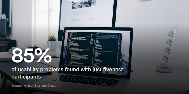
According to Nielsen Norman Group (Nielsen & Landauer), 5 users find 85% of usability problems. You don't need hundreds of participants. You need a handful of people and the right questions.
Before the test: screening and context questions
These questions help you understand who your tester is before they touch your product. They set the context for everything that follows.
1-5: Background questions
-
How would you describe your role in one sentence? Tells you if this person matches your target user.
-
Have you used a product like this before? Which one? Shows their frame of reference. Someone coming from a competitor will judge you against that experience.
-
How often do you do [the task your product solves]? Separates daily users from occasional ones. Frequent users notice different friction than newcomers.
-
What's the most frustrating part of [the task] right now? Surfaces the pain point they're hoping you solve. Compare their answer to what your product actually addresses.
-
What would a perfect solution look like for you? Sets a benchmark you can measure your product against.
Why these matter
Skipping background questions is a common mistake. Without context, you can't tell whether a tester's confusion comes from bad design or from being the wrong audience. A power user and a first-timer will struggle with completely different things.
First impression questions
First impressions happen fast. Research from the Missouri University of Science & Technology found that users form opinions about a website in less than two-tenths of a second. These questions capture that snap judgment before it fades.
-
What's the first thing you notice on this page? Shows you what's grabbing attention - and whether that's what you intended.
-
What do you think this product does, based on this screen alone? Tests whether your value proposition is clear without explanation.
-
Who do you think this is for? Reveals whether your target audience reads through in the design and copy.
-
Does anything confuse you right away? Catches the obvious problems you've become blind to after staring at it for weeks.
-
Where would you click first? Shows you the user's instinct. If it doesn't match your intended flow, your navigation has a problem.
Show the screen for five seconds, then hide it. Ask questions 6-8 from memory. This "five-second test" reveals what actually sticks versus what your design buries.
Task-based questions (asked during the test)
This is the core of user testing. You give someone a task and watch what happens. The questions here should guide without leading.
11-20: Navigation and findability
-
Can you find [specific feature or page]? The simplest test. Either they find it or they don't - and the path they take tells you everything.
-
How would you go about signing up for an account? Tests your onboarding flow end to end.
-
You want to [specific goal]. Walk me through what you'd do. Open-ended enough to see their natural approach without steering them.
-
What do you expect to happen when you click that? Asked before they click, this catches expectation mismatches. If they expect one thing and get another, that's a UX problem.
-
Is there anything on this page you'd ignore completely? Identifies visual clutter and elements that aren't earning their screen space.
-
Can you find the information you'd need to make a purchase decision? Tests whether your product page has the right content in the right place.
-
How would you get back to where you started? Tests navigation reversibility. Users who can't go back feel trapped.
-
What would you search for to find this? Reveals the vocabulary your users actually use - which might not match your labels.
-
Is there anything missing from this page that you'd expect to see? Catches gaps between user expectations and what you've provided.
-
If you got stuck here, what would you do next? Shows whether your help options (search, support, docs) are discoverable.
21-28: Understanding and clarity
-
Can you tell me what this section means in your own words? If they can't explain it, your copy isn't working.
-
What does this button/label mean to you? Tests individual UI labels. "Submit" might feel aggressive. "Get started" might feel vague.
-
Is there anything on this page you find confusing? Direct and simple. People will point at things.
-
What do you think happens after you complete this step? Tests whether your flow communicates what comes next. Uncertainty causes drop-offs.
-
Does anything on this page feel unnecessary? Identifies bloat. If five testers all say the same element is pointless, remove it.
-
How confident are you that you completed that task correctly? Confidence doesn't always match accuracy. Someone who thinks they succeeded but didn't has a different problem than someone who knows they failed.
-
On a scale of 1-5, how easy was that to do? Quick quantitative benchmark you can track across iterations.
-
Was there a point where you almost gave up? Where? Pinpoints the exact moment of maximum friction.
| Question type | What it reveals | When to use it |
|---|---|---|
| Navigation | Where users get lost | Early in product development |
| Clarity | What copy or labels confuse people | Before launch or after redesign |
| Confidence | Whether users trust they did it right | Checkout flows, form submissions |
| Abandonment | The specific friction point | When you see high drop-off rates |
Post-task questions
After the task is done, you want the user's overall impression while the experience is still fresh.
29-35: Reflection and comparison
-
What was the hardest part of what you just did? Even if they succeeded, something was harder than it needed to be.
-
What was the easiest part? Tells you what's already working - so you don't accidentally break it in a redesign.
-
How would you describe this product to a friend? Their description is your real positioning. If it doesn't match your marketing, one of you is wrong.
-
Would you use this again? Why or why not? Intent to return is a stronger signal than satisfaction ratings.
-
How does this compare to what you currently use? Competitive intelligence straight from the people who matter most.
-
What would you change about the experience? Open-ended redesign prompt. Users often suggest surprisingly practical fixes.
-
Was there anything you expected to be able to do but couldn't? Reveals feature gaps and unmet expectations.
36-40: Emotional and behavioural
-
How did the experience make you feel? This sounds soft, but emotions drive behaviour. Frustrated users don't come back.
-
Was there a moment you felt surprised - good or bad? Surprise reveals expectation gaps. Good surprises are features worth marketing. Bad ones are bugs worth fixing.
-
Did you trust this product with your information? Why or why not? Trust questions are especially telling for sign-up flows, payment pages, and anything asking for personal data.
-
If this product cost money, would you pay for it based on what you just experienced? Willingness to pay is the most honest quality signal you'll get.
-
Is there anything else you want to tell us that we didn't ask about? The catch-all. Some of the best insights come from this question because the user is no longer following your script.
Why video recordings change what you learn
Written survey answers compress reality. Someone types "the checkout was fine" and you move on. But if you'd watched them do it, you'd have seen the three wrong clicks, the squint at the shipping options, and the 40-second pause on the payment page.
Video captures what users won't - or can't - tell you in words.
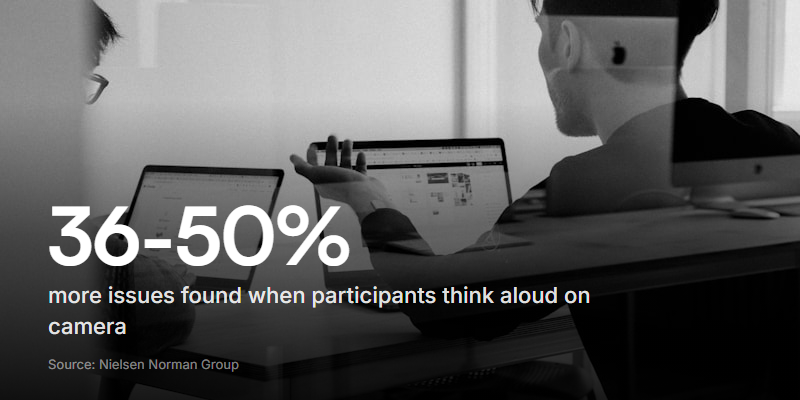
According to MeasuringU (Sauro & Lewis, 2024 - based on 153 usability test videos), think-aloud testing uncovers 36-50% more problems than silent observation. When users narrate their thoughts on camera, they surface confusion they wouldn't bother typing out.
And Maze's Future of User Research 2026 report (surveying 500 researchers) found that 82% of researchers say interpreting nuance and emotion is an essential human function that automated tools can't replace. The micro-expressions, the tone shifts, the hesitations before a click - these are signals that only show up on video.
Here's what video reveals that text surveys miss:
- Hesitation. A user hovering over two buttons for six seconds before choosing wrong. That pause is invisible in analytics.
- Facial expressions. The frown when they read your pricing page. The eyebrow raise when a feature works better than expected.
- Workarounds. Users scrolling past your intended flow to find a different path. They won't mention this in a survey because they don't realise they're doing it.
- Think-aloud moments. "Wait, where did that go?" or "I thought this would be..." - the running commentary that reveals their mental model.
How to run video user testing without live sessions
Live user testing sessions work, but they're expensive and hard to schedule. You need a moderator, a note-taker, screen recording software, and everyone online at the same time. For many teams - especially small ones - that's too much overhead to run regularly.
Async video testing solves this. You send a link. The participant opens it, reads each task or question, and records their screen and camera as they work through it. No scheduling. No moderator needed in real time.
The format works well for user testing because:
- Participants behave more naturally alone. No observer effect. No performance anxiety. They interact with your product the way they would at home.
- You can test across time zones. Send the link to five people in five countries. Responses come back overnight.
- Reviewing is faster than attending. Watch at 2x speed. Scrub to the parts that matter. A 20-minute session becomes a 10-minute review.
With a tool like Clipform, you can set up a user testing session as a video form - present each task as a step, let the participant record their screen and talk through what they're doing, and collect all the responses in one place with auto-transcription. It's an async video interview format applied to product research.
Common mistakes that ruin user testing questions
Even good questions can fail if you ask them wrong. Watch out for these:
Leading questions. "Don't you think this button is hard to find?" tells the user what you want to hear. Try "How would you go about doing X?" instead.
Double-barrelled questions. "Was the sign-up process easy and fast?" is two questions pretending to be one. The sign-up might be easy but slow. Split them.
Asking too many questions. After 30 minutes, people start giving shorter answers. Aim for 10-15 questions per session. Quality drops fast after that.
Not watching the recording. If you're only reading transcripts, you're missing the body language, tone, and hesitation that give the answers their real meaning. This is where video earns its keep.
Testing too late. If your product is already built and shipped, you're doing validation, not discovery. Test early with prototypes and wireframes - the fixes are cheaper and the feedback is more honest.
The best time to ask user testing questions is before you've written a single line of code. The second best time is right now.
How to pick the right questions for your test
Not every question belongs in every test. Start with your goal, then work backwards.
| Your goal | Best question types | Suggested numbers |
|---|---|---|
| Test a new feature | Task-based (11-20), clarity (21-28) | 8-10 questions |
| Evaluate a competitor | Background (1-5), comparison (33) | 6-8 questions |
| Validate a prototype | First impression (6-10), confidence (26-27) | 8-12 questions |
| Diagnose a drop-off | Task-based (11-20), abandonment (28) | 6-8 questions |
| Pre-launch check | All categories, focused on critical paths | 12-15 questions |
Pick one goal per test. Trying to answer everything at once means you'll answer nothing well.
Making user testing a habit, not a project
The teams that build the best products don't run user testing once before launch. They run it continuously - small, quick rounds of 3-5 people every couple of weeks.
That sounds like a lot of work. It doesn't have to be. With async video, each round takes an hour to set up and a couple of hours to review. No scheduling. No travel. No lengthy reports.
The questions in this guide aren't meant to be used once. Pick a set, run a test, watch what happens, adjust. Swap in different questions for different stages of your product. The list is a toolkit - pull out what you need, when you need it.
Start with five users and ten questions. That's enough to find the problems that matter most. You can always go deeper later, but the first round will probably give you more to fix than you expected.