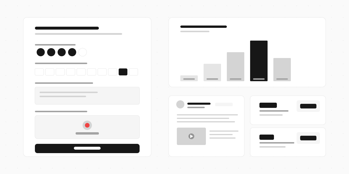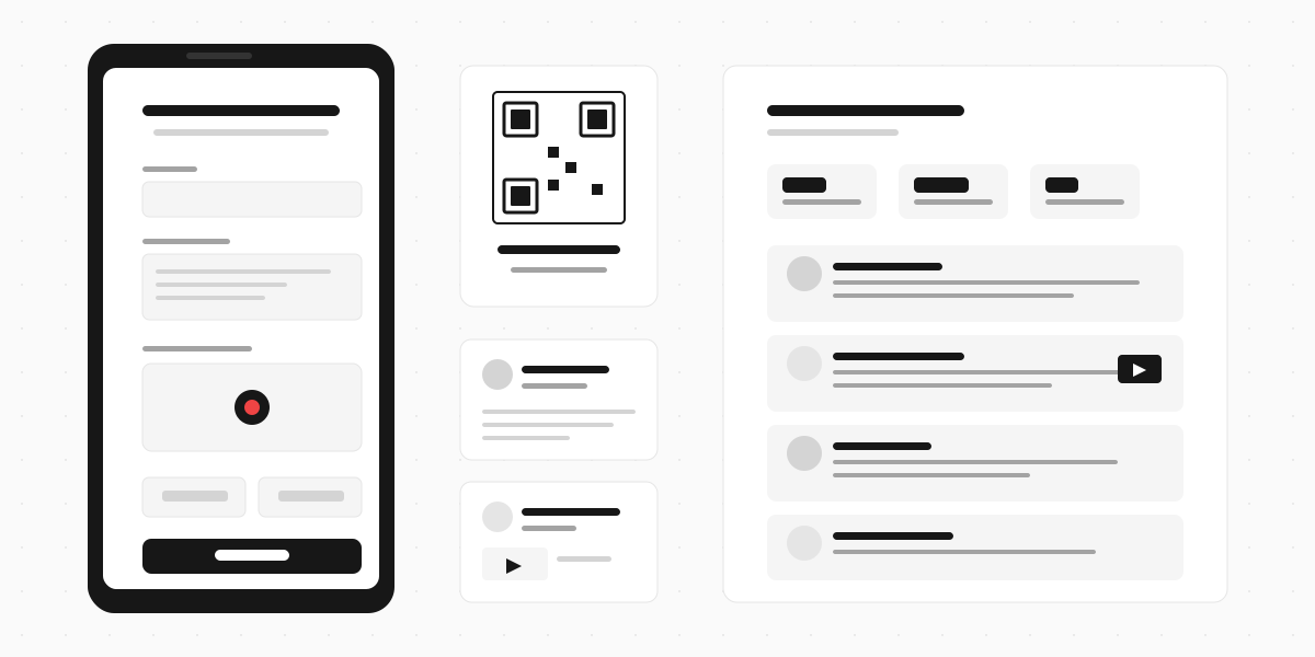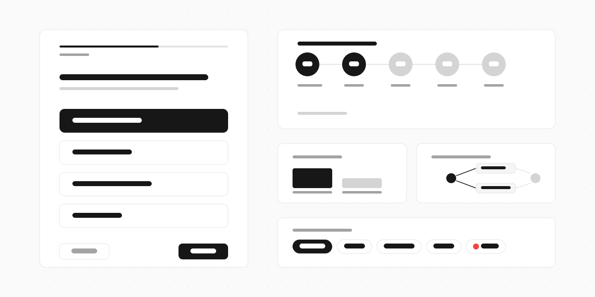
A conversational form shows one question at a time instead of displaying every field on a single page. The user answers, hits next, and the form moves to the next question. It works like a conversation - each answer builds on the last - instead of dropping a wall of fields and hoping people fill them all in.
Typeform popularised this format around 2014, and it's since become a standard UX pattern across the industry. The core idea is simple: asking one question at a time feels less overwhelming than presenting twenty fields at once. And the data backs it up. According to Typeform's Data On Data Report, which analysed 2.6 million forms and 568 million responses, conversational forms averaged a 47.3% completion rate compared to the industry average of 21.5%.
This guide covers how conversational forms work, when they're the right choice, examples of different types, and how to build one.

How conversational forms work
A traditional form renders every field on one page. A conversational form breaks those fields into individual screens, each showing a single question. The user navigates forward (and sometimes back) through the sequence.
Most conversational form builders add three things on top of the one-question-at-a-time layout:
Progress indicators. A bar or step counter that shows how far through the form the user is. This reduces the "how much longer?" anxiety that causes people to abandon forms midway.
Conditional logic. The next question changes based on the previous answer. If someone says "I'm a first-time buyer," skip the questions about their current property. If they say "I'm selling," show different follow-up questions. This means every respondent sees only the questions relevant to them.
Keyboard navigation. Users can press Enter to advance and use keyboard shortcuts to select options. This makes the form feel fast and fluid, especially on desktop. It's a small detail that changes how the form feels to use.
The combination of these three elements is what separates a conversational form from a simple multi-step form. Multi-step forms break a long form into pages. Conversational forms make the experience feel like a dialogue.

Why conversational forms get more completions
The completion rate gap is real, but understanding why it exists matters more than the numbers.
Reduced cognitive load. Seeing one question means making one decision. A traditional form with 15 visible fields forces the user to scan everything, prioritise what to fill in first, and estimate how long it'll take. That mental overhead is where abandonment starts.
Commitment escalation. Once someone answers the first question, they've invested effort. The progress bar shows they're 10% done. Then 20%. The sunk cost effect works in your favour - each answered question makes the next one more likely to be answered.
Shorter perceived time. A 10-question conversational form and a 10-field traditional form take roughly the same time to complete. But the conversational form feels faster because the user never sees all ten questions at once. Perception matters more than reality here.
Better mobile experience. Traditional forms on mobile are painful. Tiny input fields, scrolling past questions you've already answered, accidentally tapping the wrong field. Conversational forms are naturally full-screen on mobile, with each question sized for a thumb.
The same Typeform report found that forms including images or video saw completion rates increase by 120.6%. When the conversational format is paired with rich media - showing a photo, playing a video, or asking the user to record a response - the effect compounds.
Conversational form examples
Here's how different industries use conversational forms, with the types of questions that work best in each case.
Lead qualification
A marketing agency needs to understand a prospect before the first call. Instead of a static contact form with name, email, company, budget, and timeline crammed together, a conversational form asks:
- What's your name?
- What does your company do? (text input)
- What's your marketing budget? (multiple choice: under $5k, $5-20k, $20-50k, $50k+)
- What are you looking for help with? (checkboxes: SEO, paid ads, content, social, brand strategy)
- When do you want to start? (multiple choice: ASAP, 1-3 months, just researching)
- Email and phone
Each answer builds context. By the time the agency gets the lead, they already know whether it's worth a call. The prospect never felt interrogated because they answered one question at a time.
Job applications
A company hiring for a customer support role asks applicants to introduce themselves through a conversational form:
- Welcome screen with role description
- What's your name?
- Why are you interested in this role? (video response - 60 seconds)
- Describe a time you handled a difficult customer (video or text)
- Upload your CV
- Contact details
The video questions make this far more revealing than a traditional application form. Hiring managers can see communication skills, personality, and enthusiasm before booking an interview. And applicants who record video responses tend to be more invested in the role.
Customer feedback
After a purchase or interaction, a feedback form asks:
- How would you rate your experience? (star rating)
- What went well? (multiple choice with "other")
- What could be better? (open text)
- Would you recommend us? (NPS scale)
- Optional: record a quick video about your experience
This works better than a long survey email because each question is focused. Respondents give more thoughtful answers when they're not distracted by what's coming next.
Event registration
A conference registration that collects attendee preferences:
- Your details (name, email, company)
- Which sessions interest you? (multi-select)
- Any dietary requirements? (multiple choice)
- Do you want to join the networking dinner? (yes/no)
- T-shirt size (if applicable)
The conditional logic shines here - the networking dinner question only appears if it's relevant, and the dietary question branches into specifics if someone selects an allergy.
When to use a conversational form (and when not to)
Conversational forms aren't always the right choice. The format works best in specific situations.
Good fit
Longer forms (7+ questions). The more questions you have, the bigger the advantage. A 3-field contact form doesn't need the conversational treatment. A 15-question application does.
Qualifying or segmenting respondents. When different answers lead to different follow-up questions, conditional logic makes the experience dramatically better. Traditional forms either show every question to everyone or hide them with JavaScript that feels clunky.
Video or rich media responses. If you want respondents to record a video, upload a file, or interact with visual content, the conversational format gives each element the full screen. Trying to wedge a video recorder into a traditional form layout never looks right.
Mobile-first audiences. If most respondents will be on their phone, conversational forms are almost always better. The full-screen, one-question design is built for mobile in a way traditional forms are not.
Poor fit
Quick utility forms. Login, search, checkout, newsletter signup - these are forms where speed matters and the user wants to finish in three seconds. Don't make someone click "Next" four times to enter a name and email.
Reference forms. If people need to see all the fields at once (like a booking form where dates, times, and room types are interdependent), a traditional layout is better. Conversational forms hide context that the user might need to make a decision.
Repeat-use forms. Internal tools that the same team fills out daily should prioritise speed over experience. Tab-to-next-field is faster than click-next-question.
A good rule of thumb: if the form has more than 6 questions and the respondent is filling it out for the first time, a conversational format will usually outperform a traditional one. If the form has 3 or fewer fields, or the user fills it out regularly, keep it traditional.
How to build a conversational form
Step 1: Map out your questions
Write every question you want to ask, then cut ruthlessly. Each question in a conversational form gets its own screen, which means each one needs to earn its place. If a question doesn't change what you do with the response, drop it.
Group related questions together. Name and email belong in sequence. Don't put a "what's your favourite colour?" between "what's your company?" and "what's your role?"
Step 2: Add conditional logic
Identify where answers should branch. Common patterns:
- Skip logic: if the answer is "No," skip the next two questions
- Branching: different answers lead to different question sequences entirely
- Piping: use the respondent's name or previous answer in the next question ("Thanks, Sarah. Now tell us about...")
Don't over-engineer the logic. Three or four branch points is plenty for most forms. More than that becomes hard to test and maintain.
Step 3: Choose your answer types
Mix up the input types to keep the experience varied:
- Multiple choice for closed questions (fast to answer, easy to analyse)
- Open text for opinions and details (gives you qualitative depth)
- Rating scales for satisfaction and NPS questions
- File uploads for CVs, portfolios, documents
- Video responses for personal introductions, testimonials, and feedback where tone and body language matter
- Date and time pickers for scheduling
Variety keeps respondents engaged. Five multiple choice questions in a row feels like a quiz. Mixing in an open text and a video prompt breaks the rhythm and gets richer responses.
Step 4: Design the flow
- Start with something easy. Name or a simple multiple choice. Don't open with a video recording or a long text question - you'll lose people before they've committed.
- Put the hardest question in the middle. By that point, the sunk cost effect is working for you. People who've answered four questions will push through a harder fifth.
- End with contact details. Once someone has invested time answering your questions, they're more likely to hand over their email. Asking for it first reverses the value exchange.
Step 5: Test on mobile
Open the form on your phone before sharing it. Check that text inputs trigger the right keyboard, buttons are big enough to tap, and the progress bar isn't eating screen space. Most conversational forms look great on desktop and break on mobile - test both.
The 2026 shift: AI and video in forms
Conversational forms started as a one-question-at-a-time UI pattern. In 2026, two things are changing what "conversational" means.
AI-generated forms. Instead of manually building each question, you describe what you need and AI creates the form. Jotform recently launched AI-powered form creation where users type or speak their requirements and the system builds the form instantly. This makes the creation side conversational too, not just the respondent experience.
Video as a first-class answer type. The earliest conversational forms were text-only - text questions, text answers. But the most interesting development is treating video the same way: ask a question on screen, and the respondent records their answer on camera. This captures tone, body language, and detail that text responses miss entirely. When someone records themselves answering "why do you want this job?" or "what did you think of our product?", you get a fundamentally different quality of response.
The Typeform data showing 120.6% higher completion rates for forms with visual media suggests this direction has legs. Respondents don't just tolerate rich media in forms - they engage more with it.
Build your conversational form
The difference between a form that gets 20% completion and one that gets 50% often comes down to format. Asking one question at a time, adding smart logic, and giving respondents the option to speak instead of type turns a chore into something that feels more like a conversation.
Clipform is a conversational form builder where every question gets its own screen, supports conditional logic between steps, and lets respondents record video answers directly in the browser. No app downloads, no file uploads - respondents speak their answer and it's transcribed automatically. If you want a form that captures more than text, it's built for exactly this.